Album Art!!!
Recreating Lizzo's "Boys" in CSS
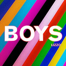
I really like the graphic design for Lizzo's song "Boys", and it seems like something CSS can handle. Afterall it's just a rainbow stripe background, and some white text with a rainbow outline. Ok maybe the rainbow outline will be tricky.
Let's do this!
Step one: Layout!
To recreate the text layout of Lizzo’s cover art I’m going to rely on
css grid and container query units.
CSS grid will allow me to place the text exactly where I
want it and by setting container-type: inline-size on my
div I can set the font sizes in cqi so they
are responsive to the size of their container.
The size of my "album" div is responsive because I used a
clamp. I personally like setting custom variables for
responsive widths so I can easily use them in a
calc function as I did to create my grid rows and
columns.
grid-template-columns: repeat(6, minmax(0, 1fr)) would
have accomplished the same thing, but it seems too much like magic.
BOYS
LIZZO
HTML
<div class="album">
    <h1 class="boys">BOYS</h1>
    <h2 class="lizzo">LIZZO</h2>
</div>
CSS
.album {
    --width: clamp(150px, 80vw, 500px);
    display: grid;
    container-type: inline-size;
    width: var(--width);
    height: var(--width);
    grid-template-columns: repeat(6, calc(var(--width) / 6));
    grid-template-rows: repeat(5, calc(var(--width) / 5));
    background: var(--clr-pink);
    box-shadow: 0.2em 0.2em 0.5em 0em var(--clr-hotpink);
    border-radius: 0.2em;
    margin-inline: auto;
    margin-block: 4rem;
}

.boys {
    grid-column: 1/-1;
    grid-row: 1/-1;
    justify-self: center;
    align-self: center;
    font-family: var(--font-lizzo);
    color: white;
    font-size: 33cqi;
}

.lizzo {
    grid-column: 5/-1;
    grid-row: 4;
    align-self: center;
    justify-self: center;
    margin-top: -3cqi;
    font-family: var(--font-lizzo);
    color: white;
    font-size: 6cqi;
}
Step two: Stripes!
I created a class called stripes and added it to my
"album" div. The stripe thickness is in % so
that it is relative to the width of the div.
Unfortunately the stripe colors don't quite repeat, so I had to lovingly place each color.
BOYS
LIZZO
HTML
<div class="album stripes">
    <h1 class="boys">BOYS</h1>
    <h2 class="lizzo">LIZZO</h2>
</div	>
CSS
.stripes 	{
    background: repeating-linear-gradient(
        -60deg,
        var(--clr-hotpink),
        var(--clr-hotpink) 4%,
        var(--clr-cyan) 4%,
        var(--clr-cyan) 12%,
        var(--clr-yellow) 12%,
        var(--clr-yellow) 20%,
        var(--clr-blue) 20%,
        var(--clr-blue) 28%,
        var(--clr-green) 28%,
        var(--clr-green) 36%,
        var(--clr-red) 36%,
        var(--clr-red) 44%,
        var(--clr-pink) 44%,
        var(--clr-pink) 52%,
        var(--clr-black) 52%,
        var(--clr-black) 60%,
        var(--clr-hotpink) 60%,
        var(--clr-hotpink) 68%,
        var(--clr-cyan) 68%,
        var(--clr-cyan) 76%,
        var(--clr-orange) 76%,
        var(--clr-orange) 84%,
        var(--clr-blue) 84%,
        var(--clr-blue) 92%,
        var(--clr-green) 92%,
        var(--clr-green) 100%
        );
    }
It may be hard to notice but in the original artwork, the stripes are
a bit darker on the bottom left corner. So I snuck in a
pseudo-element to create a very subtle grey overlay that
goes from 0 to .3 opacity using rgba colors. To do this I
had to first set the "album" div to
position: relative. I also had to change the z-index on
the "BOYS" and "LIZZO" text to z-index: 10 so they
weren't effected by the opacity gradient.
CSS
.album::before {
    --width: clamp(150px, 80vw, 500px);
    content: '';
    position: absolute;
    width: var(--width);
    height: var(--width);
    background: linear-gradient(
        -125deg,
        var(--clr-grey-transparent),
        var(--clr-grey-semi)
        );
    z-index: 0;
  }
Step three: Rainbow outline!
The rainbow outline is achieved by using a combination of
background-clip: text,
background-image: linear-gradient, and
webkit-text-stroke-color: transparent.
I created two classes, rainbow-outline-lg and
rainbow-outline-sm to add to my “BOYS” and “LIZZO” text.
They are very similar but the class for “BOYS” has one additional
color in its linear-gradient and the rainbow outline is
slightly thicker to accommodate the larger text. The
stroke width uses cqi units so that it is
responsive.
BOYS
LIZZO
HTML
<div class="album stripes">
    <h1 class="boys rainbow-outline-lg">BOYS</h1>
    <h2 class="lizzo rainbow-outline-sm">LIZZO</h2>
</div>
CSS
.rainbow-outline-lg {
    background-clip: text;
    background-image: linear-gradient(
        to right,
        var(--clr-pink),
        var(--clr-hotpink),
        var(--clr-red),
        var(--clr-yellow),
        var(--clr-hotpink)
        );
    -webkit-text-stroke-color: transparent;
    -webkit-text-stroke-width: 0.8cqi;
    }

.rainbow-outline-sm {
    background-clip: text;
    background-image: linear-gradient(
        to right,
        var(--clr-pink),
        var(--clr-hotpink),
        var(--clr-red),
        var(--clr-orange)
        );
    -webkit-text-stroke-color: transparent;
    -webkit-text-stroke-width: 0.4cqi;
    }