Album Art!!!
Recreating Discovery's "LP" in CSS Grid
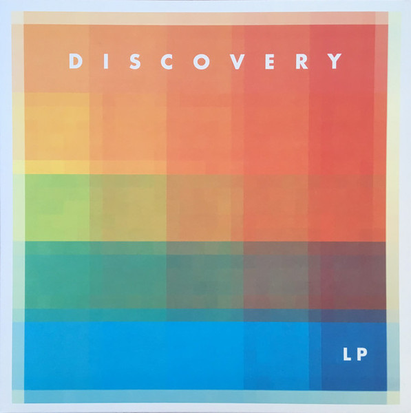
When I stare at the cover art for Discovery’s album “LP” I think about two things, CSS grid, and opacity. I mean just look at how those columns and rows of colors are interacting. They’re just begging to be turned into a grid.
And look I know what your thinking, and it is too a real band.
Grid and Opacity
I stared at this album art for days trying to un-blend its colors with
my mind. Ultimately, I decided it is a 5x5 grid composed of 5 columns
starting at yellow-orange and ending at red, and 5 rows going from
orange to blue. Each individual column is a
linear-gradient that becomes more and more transparent as
the column stretches down. Each row is a
linear-gradient that starts at one color and shifts to
another. If you separate the rows from the columns it ends up looking
something like this…
DISCOVERY
LP
DISCOVERY
LP
I prefer declaring all my colors in global CSS variables.
But with this album art I wasn't so much working with colors as 10
different linear-gradients, which led to my most intense
:root pseudo-class yet!
Please notice that every color in a linear-gradient has
an opacity between .1 and .9.
my crazy CSS :root
:root {
    --clr-background: rgb(210, 252, 239);
    --clr-text: rgb(71, 43, 82);
    --clr-textshadow1: rgba(74, 122, 255, 0.9);
    --clr-textshadow2: rgb(250, 154, 90, 0.9);

    --clr-orange1: rgba(250, 154, 90, 0.5);
    --grad-orange1: linear-gradient(
      180deg,
      rgba(250, 154, 90, 0.8),
      rgba(250, 154, 90, 0.1)
    );
    --clr-orange2: rgb(250, 133, 79, 0.5);
    --grad-orange2: linear-gradient(
      180deg,
      rgba(250, 133, 79, 0.9),
      rgba(250, 133, 79, 0.1)
    );
    --clr-orange3: rgb(247, 123, 75, 0.5);
    --grad-orange3: linear-gradient(
      180deg,
      rgba(247, 123, 75, 0.9),
      rgba(247, 123, 75, 0.1)
    );
    --clr-orange4: rgb(253, 99, 71, 0.5);
    --grad-orange4: linear-gradient(
      180deg,
      rgba(253, 99, 71, 0.9),
      rgba(253, 99, 71, 0.2)
    );
    --clr-orange5: rgb(255, 74, 74, 0.5);
    --grad-orange5: linear-gradient(
      180deg,
      rgba(255, 74, 74, 0.9),
      rgba(255, 74, 74, 0.3)
    );
    --grad-raibow1: linear-gradient(
      90deg,
      rgb(250, 154, 90, 0.9),
      rgb(255, 74, 74, 0.9)
    );
    --grad-raibow2: linear-gradient(
      90deg,
      rgb(252, 248, 14, 0.9),
      rgb(255, 74, 74, 0.9)
    );
    --grad-raibow3: linear-gradient(
      90deg,
      rgb(134, 252, 24, 0.9),
      rgba(252, 140, 13, 0.9)
    );
    --grad-raibow4: linear-gradient(
      90deg,
      rgba(10, 179, 123, 0.8),
      rgba(8, 109, 75, 0.9)
    );
    --grad-raibow5: linear-gradient(
      90deg,
      rgb(29, 252, 233, 0.9),
      rgba(74, 122, 255, 0.9)
    );

    --font-lizzo: system-ui, sans-serif;
    --font-handwriting: 'Indie Flower', cursive;
    --font-pumpkin: 'Cherry Bomb One';
}
COMBINING THE ROWS AND COLUMNS
When you start layering the columns and rows together, the squares
of colors begin to appear. The z-index of the rows were
set to come in behind the columns since the columns fade to
practically transparent. In the original album art the rows and
columns are slightly offset creating even more color interactions.
In an attempt to recreate this effect I offset some of the
margins on the rows, and added
box-shadows to the columns.
DISCOVERY
LP
DISCOVERY
LP
To create this album art all you need to do is create a 5x5 grid with
a div for every row and column's linear-gradient.
<div class="album-wrapper">
  <div class="album-grid">
    <h1 class="discovery">DISCOVERY</h1>
    <div class="column1"></div>
    <div class="column2"></div>
    <div class="column3"></div>
    <div class="column4"></div>
    <div class="column5"></div>
    <div class="row1"></div>
    <div class="row2"></div>
    <div class="row3"></div>
    <div class="row4"></div>
    <div class="row5"></div>
    <h2 class="lp">LP</h2>
  </div>
</div>.album-wrapper {
max-width: fit-content;
margin-inline: auto;
margin-bottom: 3rem;
padding: 1.5%;
box-shadow: 0.25em 0.25em 1em 0em var(--clr-textshadow1);
}
.album-grid {
--width: clamp(250px, 30cqi, 400px);
display: grid;
container-type: inline-size;
height: var(--width);
width: var(--width);
grid-template-columns: repeat(5, calc(var(--width) / 5));
grid-template-rows: repeat(5, calc(var(--width) / 5));
font-family: var(--font-lizzo);
}
.discovery {
grid-column: 1 / -1;
grid-row: 1;
align-self: center;
justify-self: center;
color: white;
font-size: 7cqi;
letter-spacing: 5cqi;
margin-right: -5cqi;
font-weight: 600;
opacity: 0.75;
z-index: 10;
}
.lp {
grid-column: 5;
grid-row: 5;
align-self: center;
justify-self: center;
color: white;
font-size: 6cqi;
letter-spacing: 1cqi;
font-weight: 600;
opacity: 0.75;
z-index: 10;
}
.column1 {
grid-column: 1;
grid-row: 1 / 6;
background: var(--grad-orange1);
box-shadow: 0.2em 0em 10em 0em var(--clr-orange1);
z-index: -1;
}
.column2 {
grid-column: 2;
grid-row: 1 / 6;
background: var(--grad-orange2);
box-shadow: 0.2em 0em 8em 0em var(--clr-orange2);
z-index: -1;
}
.column3 {
grid-column: 3;
grid-row: 1 / 6;
background: var(--grad-orange3);
box-shadow: 0.1em 0em 8em 0em var(--clr-orange3);
z-index: -1;
}
.column4 {
grid-column: 4;
grid-row: 1 / 6;
background: var(--grad-orange4);
box-shadow: 0.1em 0em 8em 0em var(--clr-orange4);
z-index: -1;
}
.column5 {
grid-column: 5;
grid-row: 1 / 6;
background: var(--grad-orange5);
z-index: -1;
}
.row1 {
grid-column: 1 / 6;
grid-row: 1;
background: var(--grad-raibow1);
z-index: -10;
}
.row2 {
grid-column: 1 / 6;
grid-row: 2;
background: var(--grad-raibow2);
z-index: -10;
margin-top: -2cqi;
}
.row3 {
grid-column: 1 / 6;
grid-row: 3;
background: var(--grad-raibow3);
z-index: -10;
margin-top: -2cqi;
}
.row4 {
grid-column: 1 / 6;
grid-row: 4;
background: var(--grad-raibow4);
z-index: -10;
margin-top: -2cqi;
}
.row5 {
grid-column: 1 / 6;
grid-row: 5;
background: var(--grad-raibow5);
z-index: -10;
margin-top: -2cqi;
}